 https://www.absolutelykareen.co.uk/wp-content/uploads/2023/04/article-one-love.png
600
600
Kareen Cox
https://www.absolutelykareen.co.uk/wp-content/uploads/2023/07/AK-logo-update-white-1030x149.png
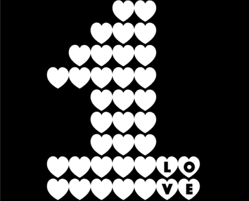
Kareen Cox2022-05-16 16:06:582023-05-17 15:33:26One Love Exhibition
https://www.absolutelykareen.co.uk/wp-content/uploads/2023/04/article-one-love.png
600
600
Kareen Cox
https://www.absolutelykareen.co.uk/wp-content/uploads/2023/07/AK-logo-update-white-1030x149.png
Kareen Cox2022-05-16 16:06:582023-05-17 15:33:26One Love Exhibition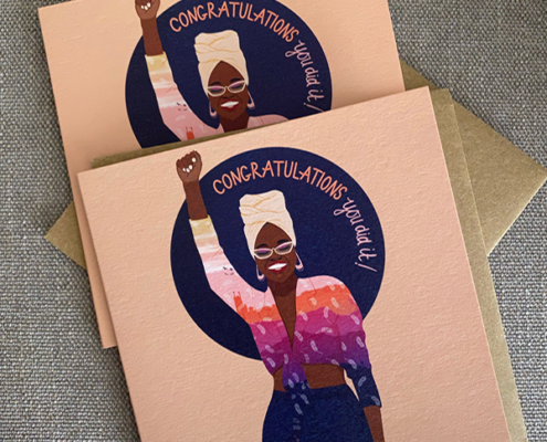 https://www.absolutelykareen.co.uk/wp-content/uploads/2023/04/article-congratulations.png
600
600
Kareen Cox
https://www.absolutelykareen.co.uk/wp-content/uploads/2023/07/AK-logo-update-white-1030x149.png
Kareen Cox2021-10-24 22:17:132023-05-18 17:58:20Congratulations. You did it!
https://www.absolutelykareen.co.uk/wp-content/uploads/2023/04/article-congratulations.png
600
600
Kareen Cox
https://www.absolutelykareen.co.uk/wp-content/uploads/2023/07/AK-logo-update-white-1030x149.png
Kareen Cox2021-10-24 22:17:132023-05-18 17:58:20Congratulations. You did it!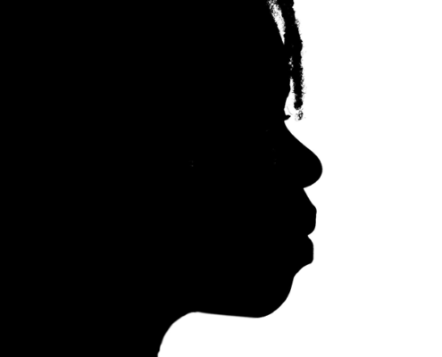 https://www.absolutelykareen.co.uk/wp-content/uploads/2023/04/article-silhouettes.png
600
600
Kareen Cox
https://www.absolutelykareen.co.uk/wp-content/uploads/2023/07/AK-logo-update-white-1030x149.png
Kareen Cox2016-11-28 18:30:282023-08-08 11:52:48Silhouettes: The Good, The Bad and The Downright ‘Orrible
https://www.absolutelykareen.co.uk/wp-content/uploads/2023/04/article-silhouettes.png
600
600
Kareen Cox
https://www.absolutelykareen.co.uk/wp-content/uploads/2023/07/AK-logo-update-white-1030x149.png
Kareen Cox2016-11-28 18:30:282023-08-08 11:52:48Silhouettes: The Good, The Bad and The Downright ‘Orrible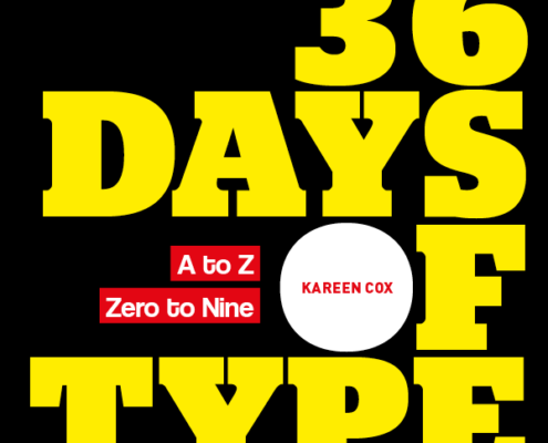 https://www.absolutelykareen.co.uk/wp-content/uploads/2023/04/article-36-days.png
600
600
Kareen Cox
https://www.absolutelykareen.co.uk/wp-content/uploads/2023/07/AK-logo-update-white-1030x149.png
Kareen Cox2016-05-19 19:00:142023-05-17 15:33:1036 Days of Type
https://www.absolutelykareen.co.uk/wp-content/uploads/2023/04/article-36-days.png
600
600
Kareen Cox
https://www.absolutelykareen.co.uk/wp-content/uploads/2023/07/AK-logo-update-white-1030x149.png
Kareen Cox2016-05-19 19:00:142023-05-17 15:33:1036 Days of Type